Branding and design strategy

Project
Branding strategy
Summary
Developing Woowii HR’s Brand Identity for a Modern and Engaging HR Platform
Responsibilities
Creative Direction
Art Direction
Overview
Woowii HR is a human resources software company that provides an innovative and intuitive platform to simplify HR processes for businesses. Their solution is designed to automate and streamline key HR functions such as recruitment, employee management, payroll, and performance tracking. As Woowii HR prepared to launch, they needed a brand identity that would communicate their modern, technology-driven approach while also resonating with both HR professionals and employees.
In 2023, Woowii HR partnered with us to create a comprehensive brand identity, including logo design, color palette, typography, and overall visual style. Our goal was to develop a brand that would stand out in the competitive HR technology space and convey Woowii HR’s values of simplicity, innovation, and user-centric design.
Client: Woowii HR
Project: Branding Development
Sector: HR Technology
Date: 2023

The Challenge
As a new entrant into the crowded HR technology market, Woowii HR needed a strong brand identity that would differentiate them from competitors while clearly communicating the benefits of their platform. The brand had to appeal to a broad audience, including HR professionals, business leaders, and employees, while also conveying a sense of trust, efficiency, and innovation.
The key challenges included:
Standing Out in a Crowded Market: The HR software industry is highly competitive, with many well-established players. Woowii HR needed a unique brand identity that would capture attention and communicate the platform’s distinct value proposition.
Balancing Professionalism with Approachability: The brand needed to strike a balance between being professional enough to appeal to HR executives and business leaders, while also being approachable and user-friendly for employees who would interact with the platform regularly.
Creating a Cohesive Visual Identity: Woowii HR required a consistent visual identity that could be applied across all touchpoints, including the website, marketing materials, social media, and the software interface.


The Solution
We approached the branding project with a focus on creating a visual identity that embodied Woowii HR’s core values—simplicity, efficiency, and modern technology—while remaining versatile enough to appeal to a diverse audience.
The solution featured:
Step 1: Brand Discovery and Research
Before diving into the creative process, we conducted a thorough discovery phase to understand Woowii HR’s vision, target audience, and competitive landscape. This involved:
Stakeholder Interviews: We held discussions with key stakeholders at Woowii HR to understand their goals, mission, and what they wanted the brand to communicate. We identified that the key messaging pillars were simplicity, user-friendliness, and innovation.
Competitive Analysis: We researched competitors in the HR software space to identify common visual themes and find opportunities for differentiation. Many competitors used conservative, corporate-style branding, leaving room for Woowii HR to stand out with a fresh, modern approach.
Audience Personas: We created personas for Woowii HR’s target audience, which included HR managers, small-to-medium business owners, and employees. The brand needed to speak to both decision-makers and end-users in a way that felt accessible and trustworthy.
Step 2: Logo Design Process
With a clear understanding of Woowii HR’s vision and market positioning, we began the logo design process, focusing on creating a mark that would reflect the platform’s innovative and user-friendly nature. Our logo design process involved the following stages:
Concept Exploration: We started by sketching out several logo concepts that aligned with Woowii HR’s core values. We explored different themes, including technology, connectivity, people, and simplicity. The goal was to create a logo that felt modern and approachable without being overly complex.
Initial Design Concepts: After narrowing down the themes, we developed a range of digital logo concepts. These included both abstract symbols and more literal representations of people and connectivity, emphasizing Woowii HR’s role in bringing HR professionals and employees together through technology.
Client Feedback and Iteration: We presented the initial concepts to Woowii HR’s stakeholders, discussing the meaning and rationale behind each design. Based on their feedback, we refined the designs to focus on a clean, simple logo that would resonate with both HR professionals and employees.
Step 3: Final Logo Design
After several iterations and feedback sessions, we arrived at the final logo design. The final logo is a modern, minimalist representation of the company’s values and vision.
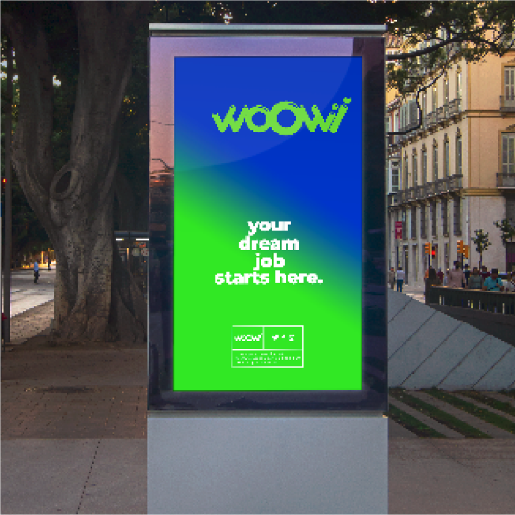
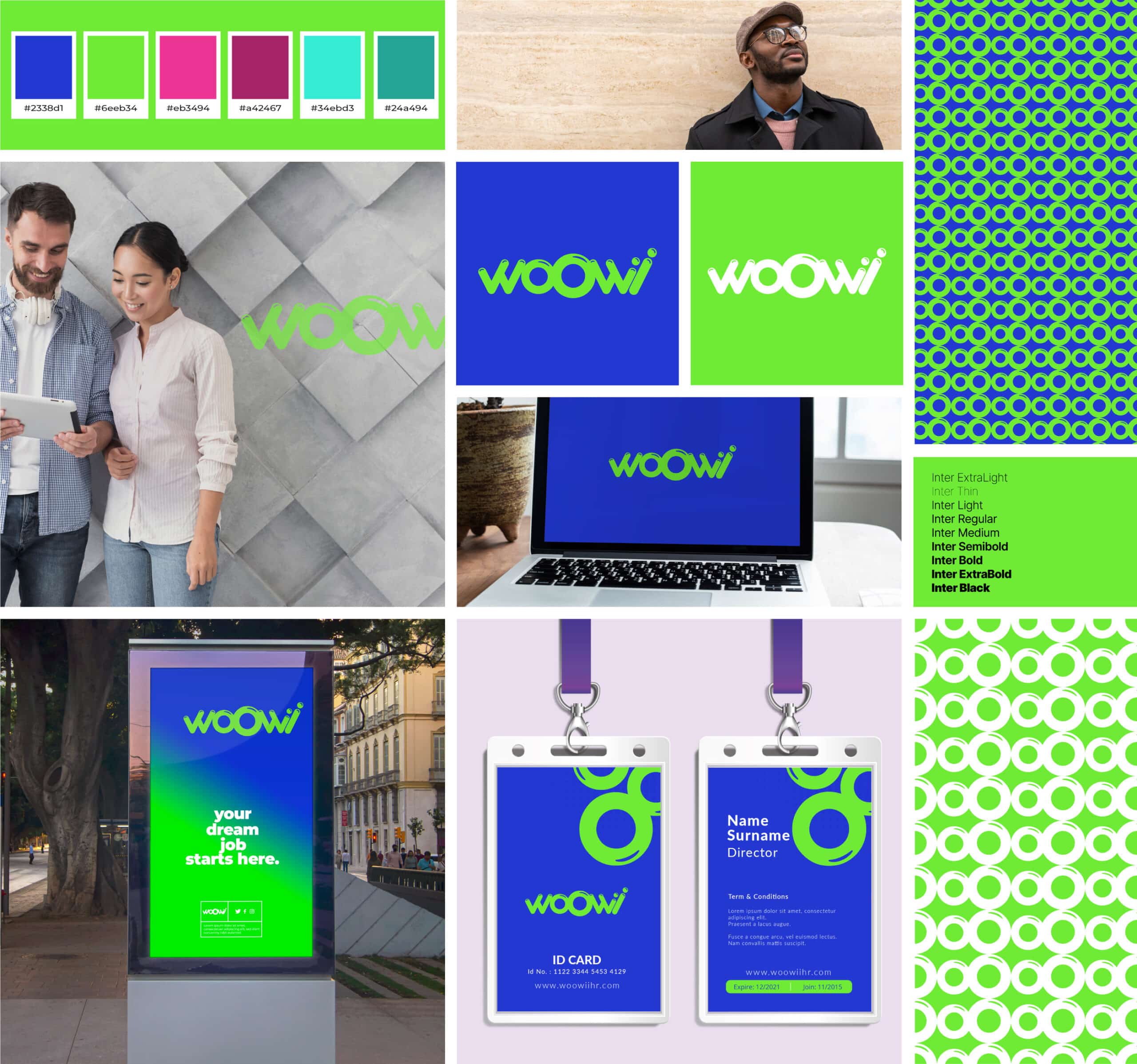
Logo Mark: The logo features a clean, geometric symbol that represents both connectivity and people, central to HR management. The shape of the logo suggests the flow of information and collaboration within HR processes. Its circular design creates a feeling of unity, reflecting the idea of seamless integration between HR teams and employees.
Typography: We selected a modern, sans-serif typeface that is clean and easy to read, contributing to the overall feeling of simplicity and efficiency. The font choice complements the geometric logo mark, reinforcing Woowii HR’s emphasis on a streamlined user experience.
Color Palette: The final color palette was carefully chosen to balance professionalism with approachability. We selected a calming blue as the primary color, symbolizing trust, reliability, and technology. A vibrant accent color, such as green, was added to bring energy and innovation to the brand, creating a balanced contrast that appeals to both HR professionals and end-users.
Step 4: Brand Guidelines and Visual Identity
Once the logo was finalized, we developed comprehensive brand guidelines to ensure consistency across all of Woowii HR’s marketing materials and digital platforms. These guidelines included:
Color Palette: The primary blue and green accents were expanded into a complete color palette, including complementary shades for use in backgrounds, buttons, and other design elements.
Typography: We outlined the use of the chosen typefaces across headings, subheadings, and body text to maintain a consistent and readable hierarchy throughout the website and other marketing materials.
Iconography and Visual Elements: We developed a custom set of icons to represent different HR processes (such as payroll, recruitment, performance management), ensuring a cohesive look throughout the platform’s user interface and marketing content.
Step 5: Application Across Digital Platforms
With the new brand identity in place, we applied it to various digital touchpoints, ensuring that the visual language was consistent across all platforms. Key applications included:
Website Design: We integrated the new branding into Woowii HR’s website, creating a visually appealing and user-friendly interface that reflected the simplicity and efficiency of the platform. The branding guidelines were used to create a cohesive look and feel across all pages.
Social Media: We created branded social media templates and assets, ensuring that Woowii HR’s social presence was visually aligned with the website and other marketing materials. The clean, modern design was applied to social media graphics, advertisements, and promotional content.
Marketing Collateral: We extended the branding to print and digital materials, such as brochures, business cards, and presentations. These materials were designed to communicate Woowii HR’s value proposition clearly and concisely, reinforcing the brand’s professional yet approachable identity.
The Results
The branding development for Woowii HR successfully positioned the company as a modern, innovative, and approachable HR solution. The new brand identity, including the logo and visual elements, helped Woowii HR stand out in a crowded market while clearly communicating its core values to its target audience.
Key results included:
Stronger Brand Recognition: The clean, memorable logo and cohesive visual identity helped Woowii HR establish a strong brand presence in the HR tech space, making it easier for potential clients to recognize and trust the platform.
Increased User Engagement: The modern and user-friendly design resonated with HR professionals and employees alike, contributing to higher engagement rates on the website and social media channels.
Consistent Brand Experience: With comprehensive brand guidelines in place, Woowii HR was able to maintain a consistent visual and messaging strategy across all digital platforms and marketing materials, reinforcing their identity as a trusted, innovative HR solution.
Brand Moodboard

Conclusion
The branding development for Woowii HR was a critical step in defining the company’s market position and helping it stand out in the competitive HR technology sector. By creating a modern, approachable brand identity and applying it across digital and physical platforms, we helped Woowii HR establish a strong presence and build trust with both HR professionals and employees.
The new branding not only reflects Woowii HR’s core values of simplicity, innovation, and efficiency but also provides the foundation for continued growth and success in the HR technology market.
Credits
Design
Eduardo Calvo – Creative and Art Director
Team
Let's grab a coffee
And Chat!
Copyright © 2025 EduCalvo. All Rights Reserved

